What is an inverted yield curve?
Find out what an inverted yield curve looks like, how it reflects bond interest rates in Canada, and what it might tell us about the economy.
Advertisement
Find out what an inverted yield curve looks like, how it reflects bond interest rates in Canada, and what it might tell us about the economy.
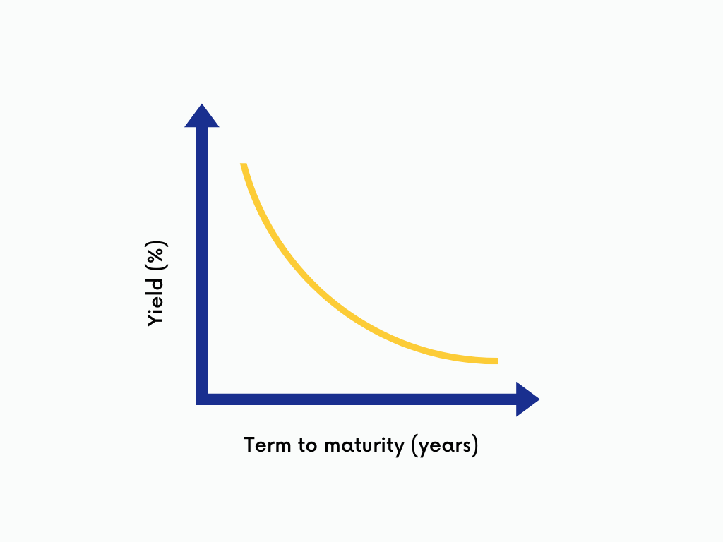
Yield curves are graphs that show the relationship between interest rates and the term to maturity of interest-bearing investments like bonds and guaranteed investment certificates (GICs). Term to maturity is plotted on the x-axis (horizontal) and yield on the y-axis (vertical). (“Term to maturity” refers to the period of time before the investor’s principal is returned to them.)
Normally, you will earn higher yields on investments held for long periods. Plotting this on a graph creates an upward sloping yield curve.
Sometimes, yields are lower for investments held for longer time periods than for identical investments with shorter terms. In this case, the yield curve slopes downwards. This is called an inverted yield curve. Historically, an inverted yield curve has been a reliable predictor of a recession.

Example: “In December 2022, yields on two-year Canadian government debt were 100 basis points higher than yields on 10-year bonds, creating a steeply inverted yield curve. Concerned about near-term economic uncertainty, investors moved money from short-term debt to longer-term debt, a shift in demand that resulted in lower yields for investments with longer terms.”
Share this article Share on Facebook Share on Twitter Share on Linkedin Share on Reddit Share on Email