Why diversify? This chart shows you why
Annual returns of key asset classes ranked from best to worst
Advertisement
Annual returns of key asset classes ranked from best to worst
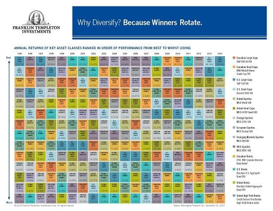
Franklin Templeton Investments has just released its annual asset-class poster called “Why Diversify?,” which shows the clear winner in 2014 was U.S. large-cap stocks, returning 23.93% in $CDN. But that doesn’t mean you should therefore rush out and stuff your new expanded TFSA with U.S. large-cap stocks. Far from it. Keep in mind the suffix to the chart: Why Diversify? Because Winners Rotate.
I always enjoy scrutinizing this chart when it comes out and have written about it several times over the years. If you’re a mutual fund investor and your advisor uses the Franklin Templeton fund family, odds are you can get the chart free through your advisor, or you can download it here.
The colour-coded chart shows annual returns of key asset classes ranked from best to worst. The asset classes are primarily stocks and bonds from around the world. It doesn’t include more esoteric asset classes like precious metals or commodities, real estate, hedge funds or short/leveraged plays or indeed even cash.
However, for the purposes of this chart, you can consider cash to be slightly above zero. So for calendar 2014, everything beat cash except Canadian small-caps, which returned minus 0.09%. European equities returned 2.82%, Canadian bonds 8.79%, Canadian large caps 12.27% and the runner-up to U.S. large caps was U.S. bonds, with a surprising (to me anyway) 15.52% return.
The strong performance of U.S. large caps and U.S. bonds speaks to the strength of the U.S. dollar relative to the languishing Canadian dollar, says Stephen Lingard, senior vice president and portfolio manager for Franklin Templeton Solutions.
U.S. large caps also did well in 2013, the chart shows, returning 41.27%, second only to the 48.14% returned by U.S. small caps. The last time U.S. large caps topped Templeton’s chart was way back in 1997 and 1995.
However, when you look at certain markets in local currency terms, there are better opportunities than U.S. large caps right now, Lingard said. For example, “Japanese equities were one of the best performers last year on a local basis.” Lingard has been long Japanese equities for two years and they have outperformed U.S. stocks by 40% in local market terms. “The Japanese yen has been one of the best markets under Abenomics.” However, you can’t see this in the chart because Japan is bundled in under global equities.
The chart is a simple way for advisors to show clients the need to spread assets around the world, in order to lower portfolio risk and enhance returns.
He cautions the chart is a kind of “rear-view mirror” and doesn’t necessarily reflect the firms’ expectations going forward. “You don’t have to look further than this year so far, where the U.S. market is the worst performer in Canadian dollar terms or local terms.”
The chart can be a useful tool for a advisors to discuss with client. It might go like this, Lingard suggests: “I know you’re in love with the U.S. equity market because it was easily the biggest winner in $CDN terms unhedged over the last five years but as you can see, winners do tend to rotate, so you may not want to overdo U.S. equities” going forward.
Despite the caution that “winners rotate,” this has not always been the case. A case in point is the long stretch between 2003 and 2007, when BRIC equities (Brazil/Russia/India/China) topped the chart in all years but 2004, when the similar asset class, emerging markets, briefly reigned supreme. As investors well know, that party ended with a bang: in 2008, BRIC equities were at the bottom of the chart with a loss of 49.14%, and emerging markets were third last at minus 41.44%.
While the main chart does look almost random, and is thus instructive, Franklin Templeton also has a second chart that is entitled Reminder: Risk is More Predictable Than Returns.
The second chart is less interesting because it’s so predictable. From 1993 to 2014, the riskiest asset class was BRIC equities almost the entire time, as measured by standard deviation in $CDN. There were only three years that wasn’t the case: emerging markets from 1993 to 1996 and Canadians small caps from 2008 to 2010.
And from 1996 to the present, Canadian bonds were consistently the lowest-risk asset class (again for Canadian investors, in $CDN). “That said, I think Canadian bonds are a little riskier than they’ve ever been because of the interest rate cycle.” Editor-at-large Jonathan Chevreau runs the Financial Independence Hub and can be reached at [email protected]
Share this article Share on Facebook Share on Twitter Share on Linkedin Share on Reddit Share on Email