7 charts that put market mayhem in perspective
The sky isn't falling. Here's the extent of the damage so far
Advertisement
The sky isn't falling. Here's the extent of the damage so far
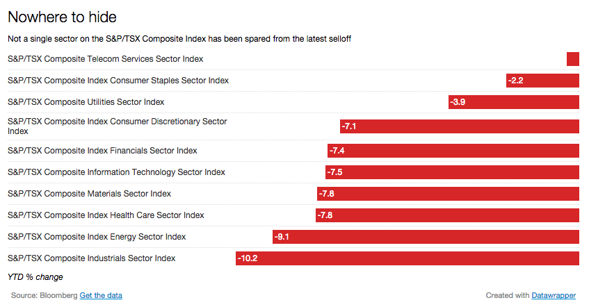
Chicken Little would have had a great number of new followers this week if he tweeted the markets were crashing. For a moment it certainly felt that way. After a relentless slide that commenced at the start of 2016, the negative pressure on markets seemed to suddenly accelerate. Worse: There seemed to be no safe place to hide.
The sky is not falling. By Friday, global markets were in rally mode. Sam Stovall, U.S. equity strategist for S&P Capital IQ + SNL wrote in a recent research note that, “the U.S. equity market is starting to look attractive to us.” He has several reasons for this. The price-to-earnings ratio estimate for 2016 is now near 15 versus its average of 16 since 2000.
But before you look at this as a bottom, note that Stovall said that things are “starting” to look attractive. Bold, circle and underline that word. Markets could still drift lower. The current market slide isn’t as deep as other historic stock market corrections. But he offers a warning: “Despite the potential for a counter-trend rally, this correction likely has further to run as lower, but still elevated, multiples remain a challenge to a V-shaped recovery.”
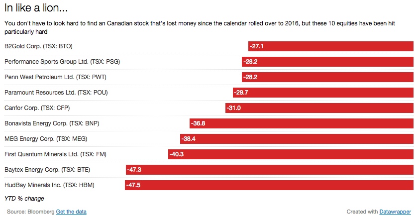
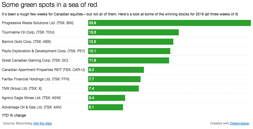
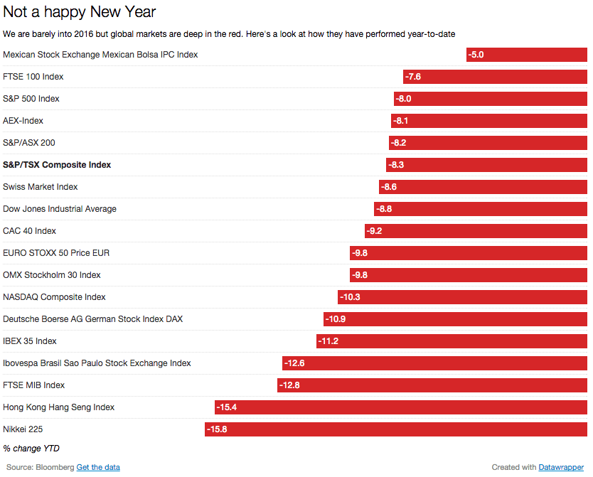
Here are seven charts* that show just how widespread the damage has been so far this year, and also a few bright spots that may surprise you.
*All data current as of Thursday, January 21
And while the markets bounced back on Friday, most investors are likely still focused on the drop mid-week. As Rick Stuchberry, vice-president and Portfolio Manager at Richardson GMP, puts it, “when something goes wrong you hear about it right way but when something goes right it takes a while to filter through the situation.”
Share this article Share on Facebook Share on Twitter Share on Linkedin Share on Reddit Share on Email