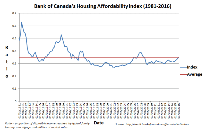
How housing affordability is declining
One chart you really need to keep an eye on in 2017
Advertisement
One chart you really need to keep an eye on in 2017

“The Bank of Canada’s Housing Affordability Index remains the indicator to watch in 2017 because if Canadians can no longer afford to own a house, it would dampen residential construction and undermine a key prop holding up the economy—not to mention possibly even endanger the financial system through rising mortgage defaults. The index, which tracks the proportion of disposable income that a representative Canadian family spends on carrying a mortgage and utilities, has indeed trended upward in recent quarters. But it remains below its long-term average, suggesting a downturn in the housing market is not imminent at the national level. Should the upward trend continue and approach the index’s peaks reached in the early 1980s and 1990s, a tumble in the housing market would be a distinct risk given how house prices cratered after those peaks occurred.”—Larry MacDonald, financial author. Twitter: @Larry_MacDonald See all 75 Charts Canadians Should Watch in 2017 on Maclean’s. Learn more on the state of Canada’s housing market, the economy and how our country will do under the reign of Donald Trump with these 75 charts, each with an explanation from an expert.
Share this article Share on Facebook Share on Twitter Share on Linkedin Share on Reddit Share on Email